Product Familiarity: The nose knows...

Sure, the picture at left looks nice - but that's only because I couldn't find a photo of anyone smelling a textbook. That's right - as reported by Reuters, a recent poll showed that "43 percent of students identified smell... as the quality they most liked about books as physical objects." Who would be interested in such a strange (leading) polling question? Why, electronic-textbook company CafeScribe of course, who's wondering why people are so reluctant to abandon physical books for their bits-and-bytes equivalents. Their solution: ship a scratch-and-sniff sticker which smells like a book to every student purchasing an e-textbook. Scratch'n'study? Yeaaaah.

But seriously now, this is interesting: the notion of encouraging new product adoption by slowly weaning the user off of the familiar - but irrelevant - trappings of an old product. We as users like to think we're above this kind of condescending trickery - and in this relatively ridiculous example, we're probably right. But the general notion may have legs - so old dogs don't have to learn quite as many new tricks!

Error Messages: From unfriendly to intimidating...

Okay, get ready for a lot of links. Ready? Here we go: From the This Is Broken group on Flickr, user us-xa.com posts this photo of a Microsoft Publisher error message, as reported by Mark Hurst on the Good Experience blog. Whew. Point is, here's the message:

"Opening this publication will access data from the following location: Error: This publication was created in a later version of Publisher and contains connections to multiple data sources. This version of Publisher cannot connect to multiple data sources. To edit your publication and leave the data source connections intact when re-opening in a later version, select 'Work without merged information.' Data from this location will be inserted in this publication where others can read it. Do you want to continue? (Yes) (No)"

On first read, this message is mostly just intimidating - a lot of text, complicated terms, and what seems to be an assumed knowledge of the underlying data structuring of a very complex piece of software - all followed by the insistence that you make a choice, YES OR NO! There's no "Cancel" option, the always-safe, oh-god-what-have-I-done button. But, when parsing the message, it actually does make sense - right up until it starts talking about selecting "Work without merged information" when the only options presented are YES OR NO!

On the other extreme is the no-info error message I sometimes get from Photoshop: "Operation could not be completed because of a program error. (Ok)" Frustrating in its own way, but not the interrogation-light hotseat of the Publisher message. So which way is better? If there's not much you can do, is it best to just leave the user in a state of frustrated but ignorant (relative) bliss? Well? YES OR NO???

Bad Marketing Combo: Milk and Tacos!

There are some products that seem like they're made to go together: peanut butter can be sold alongside jelly, cream cheese with bagels, beer and burgers. And yet, this would seem to be a very difficult thing to analyze, or determine in theory rather than in practice. It's a gut-feeling thing (literally): you probably just know it when you see it, but you definitely know it when you taste it.

And you know it when you really, truly don't: ladies and gentlemen, I present the gallon jug of milk on which is advertised tacos. Monday mornings are hard enough on their own, but when I'm assaulted with a combination of this gastronomic blasphemy when I'm just trying to prepare my coffee... well, it's too much.

Can a user's experience and satisfaction with a product really be tainted by these kinds of purely psychological, imposed associations? It's a subject for debate - but my stomach (ugh) says yes.

Color Coded Coffee - Matching up the perfect cup...

From the irreverent and irreverently-named SUCK UK studio (and through Gizmodo), MyCuppa coffee and tea mugs assist assistants in getting the boss's brew just right. Instead of requesting one or two "glops" of milk in tea or coffee of various strengths, these mugs use Pantone color-wheel-style swatches to match the shade of the drink. This makes a lot of sense, especially since the sizes of drink portions, strength of the base coffee or tea, and preparers' judgments of the proper "glop" size can vary so widely. The bad news is that the assistant now has to memorize orders for names like "Classic British" and "Builder's Brew," as they're called on the cups - and, at least for now, advertise the brand name pretty boldly to anyone within viewing range of the mugs themselves. Still, a neat idea, with the potential to make those foggy-minded mornings a little smoother.

If Plants Could Talk: The water-me vase...

From designer David Sweeney on Yanko Design and through Gizmodo, the Water Me When I Tilt vase (which needs a new name) tilts down to horizontal when the water level is low., but sits at a 30-degree angle or so when sufficiently hydrated. Personally, I can't keep myself disciplined to water my plants, so a flagging/cuing/begging system like this could really make a difference. (My plant graveyard is getting full of those poor neglected and/or overwatered souls.)

There's also something about the tilting action that's more immediate or urgent than a blinking light or a beeping sound - it's a real part of your environment, a physical entity, not just a signal. Not to mention, of course, a neat conversation piece that's holding your not-dead plant!

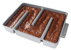
All-Edge Brownie Pan - Feels kinda wrong, tastes sooo right!

This design has the notoriety of being the first of any post on this blog to cause my fiancee's jaw to drop, and remain dropped, for something on the order of 20 seconds. We both love the edge and corner pieces of brownies, bars, and blondies (which makes for a competitive situation whenever we bake), so the Baker's Edge all-edge baking pan is just... well, words are beginning to fail me. But you get the idea - all edge and corner pieces. Brilliant!

Now, this being a use-and-usability design blog, I'm trying to find something to critique. Harder to clean? Maybe. Requires adjustment of cooking time? Probably. Some people don't like edges (like my fiancee's two friends who I also showed this to, receiving a lukewarm-at-best reception)? Apparently. Does something feel morally wrong, even slightly unholy, about an all-edge frankenbrownie? Kinda.

But, worth it? Totally. I'll be registering for one - if I can even wait that long...

Link Mugs - Usable and delightful...

From designer Jonathan Aspinall at Yanko Design (and through Gizmodo), Link Mugs use interlocking protrusions and cutouts to, well... just look at the photo. You can carry many many mugs as if by magic!

Is it functional? Sure - it gets the job done when no tray is available. Is it usable? Yeah - it may take a few seconds to get the mug assembly together, but it sure looks doable. But what I want to concentrate on here is the "delight" factor. Being the recipient of a drink brought in this way would almost certainly bring a smile to one's face; and just maybe, the coffee would taste a little better. (Just like a new putter "works" better than a scratched one - the psychology of products is all around us!) Combine this with the previously posted Stain Stamp Mug design, and homes or restaurants can sneakily augment the moods of all their patrons. A good mood is a goal worth designing for!

PowerSquid - Making your wall warts get along...

More and more of the things we plug in and power up these days are digital - which means they chug DC juice, which means they need adapters for the AC wall sockets, which means wall warts. You know, the big ugly heavy bricks on the ends of the power cords that hog more than their share of the space around the sockets. The problem is that normal powerstrips aren't designed for these behemoths - the powerstrip being a relic of 20th-century design - resulting in many of the strips' sockets going to waste.

The Redesign: The PowerSquid line of flexible power strips, shown at left.

Alternately, The Bandaid: The Power Strip Space Saver, adapting existing strips with dongles at three bucks a pop.

Sure, these are the mundane, unsexy parts of life - and remaking the powerstrip into anything but a low-margin commodity is a bad business bet. But I'll be there are a lot of happy people out there using these products, and wanting to say "thank you!"

Wine Wedge - Looks neat, but traps most bottles!

The Wine Wedge, available through LatestBuy (and made known through Gizmodo), seeks to minimalize wine storage by allowing pyramids of bottles to be supported by only two rubber/plastic wedges. It's true that it has a viscerally appreciable simplicity, and a perceivable power in its ability to allow pyramids stacked to any arbitrary/ludicrous heights.

But it's got problems, too: what about when I actually want to drink a bottle of wine that's not on the top of the pyramid? A cumbersome disassembly-and-reassembly seems to be the only way - unless there's some trick akin to the magicians' stunt of pulling the tablecloth out from under the dishes. The recommended practice of rotating the bottles periodically during storage would seem risky, too. And finally, any pyramid made of a heterogeneous mix of bottles (rather than the identical bottles shown in the photos) might suffer structural problems if all bottles don't share the same diameter.

Good lookin' design; good luck using it!

Smart Laptop Alarms - Theft deterrence the fun way...

Two software programs that recently came to my attention, iAlertU and Laptop Alarm, represent a very usable shift in the world of laptop theft prevention. Instead of physically locking the laptop to an immovable object (requiring the user to carry, get out, and install a Kensington-like laptop lock), these programs work more like car alarms: mess with the laptop and you'll suddenly be made the center of everyone's attention thanks to as much sound as can be put out by the speakers and as much flashing light as can be accomplished by the screen. What's best is that these programs use existing hardware to get the job done, and in user-friendly ways.

For example, Laptop Alarm can sound the alert if the laptop's AC power or USB mouse is unplugged, or if the computer is shut down or put in standby. This makes sense - these are things many users will be doing to set up their laptopping in the first place, so it's natural to use them as alarm triggers. iAlertU, despite the toolish name, is even more fun: it uses the Macbook's sudden motion sensor to detect movement, and uses the built-in camera to snap and email a photo of the would-be thief to a preset email address. (Check out the video.) Heck, I'd almost want my laptop to get stolen, just to track down the culprit! When something as mundane as a laptop lock starts getting fun, it's a sign of some great design.

Silly Humans: Better-looking products work better...

I was golfing last weekend with my future brother-in-law, and he was disappointed to find that his relatively new, gonna-fix-my-short-game putter had been (gasp!) scratched up a bit. He whined to his wife, speculating about a pending putter purchase, when she pointed out...

The Logical Truth: Little scratches won't affect the function of the putter.

To which he responded with....

The Psychological Truth: When it looks better, it works better. He explained the whole process: he's about to make a putt, he reaches for his club, sees those nasty little scratches, and is suddenly in a bad mood because of them. Now his mental game is off; he's not concentrating on the putt. This is how three- and four-putt holes are born.

Does this sound about right? Does your music sound worse coming from a scratched iPod? Do you not ski or snowboard as well in an out-of-style jacket? Does your dirty car make you a more irritable driver?

Yep - it may be silly, but it's real.

Brush & Rinse - Mind that gap between concept and reality...

Brush & Rinse is a great idea from Amron Experimental (which got to me, as things often do, through Gizmodo) where the careful shaping of an otherwise normal toothbrush creates a fountain for rinsing when held under the tap as shown. Yes, a great idea indeed - but my mechanical engineering instinct screams that this particular one is only an idea until proven!

As a product designer, I've encountered quite a lot of great ideas - but as a mechanical engineer, I've also recognized that many concepts suffer the fatal flaw of oversimplifying reality. In reality, things don't always line up, move smoothly, fit snugly, or in any way work as perfectly as they do in the metaphorical light bulbs over designers' heads. In this case, there's such a huge number of variables in the water stream of bathroom faucets - width, speed, aeration, consistency, and on and on - that a single geometry seems highly unlikely to work in all cases.

But, maybe it will work (I'm not a fluids guy, personally) - there are ideas that have, and ideas that will. Just don't hold your breath...

Tiny Cards in Tiny Cameras - Bad for big thumbs...

My old friend Jonathan Jackson writes with a design problem which, left unfixed, will only get worse as technology marches inexorably smallward. The problem: increasingly tiny memory cards in increasingly tiny digital cameras - specifically, getting the darn things in and out. In his Casio Elixim, which I infer to be functionally very similar to my Canon SD400 pictured at left, he writes:

"I found my flimsy 1/2 millimeter of keratin fingernail structurally too weak to disengage the spring or whatever that holds onto the card in the camera's slot." Fortunately, the fake nails of a colleague came to the rescue -but, he asks, "do I need to carry Lee Press-On nails along with me to change out cards?"

He has an excellent point - digital cameras are designed to (1) fit nicely in the pocket while (2) using off-the-shelf spring-loaded SD card readers. Having sufficient room to operate the camera - and this goes for many of the controls, too, not just the access doors - is a distant third. Look at the gargantuan relative size of my thumb in that photo, and you can see where this is headed!

As Jonathan said, "sigh."

Designer Juicer - Looks versus hazards...

Silly industrial designers. Here's a high-design juicer from designer Gibli Ortal, through Apartment Therapy. But the commentary that sticks with me is from the always observant and usually gutter-minded Gizmodo, who very correctly point out that "uh, it could end up being in the wrong place at the wrong time." Hopefully it will spend most of its time in the snazzy folded-up position, then, where the hazard is reduced - but not eliminated.

How much are we as buyers-and-users willing to pay for high-design items in terms of inconvenience, reduced functionality, of course price, and even danger? It's a rhetorical question... but the answer ain't zero.

Car Stereo FM1/FM2 - Isn't all FM the same?

As I’ve mentioned before, I love my new Honda Civic. But there are still a few design quirks in my car (power windows, keyless entry), and often cars in general, that stubbornly defy logical explanation. Today’s rant: the FM1/FM2 paradigm. Okay, so most car stereos (and I’m talking about the default stuff, not the aftermarket sets) only have six station buttons to keep the dashboard looking nice and clean. And okay, maybe most people want to be able to access more than six preset stations – especially when all of the first six are simultaneously on commercials, which happens more often than any benevolent God would allow. But why, why invoke this FM1/FM2 thing? The artificial distinction of a “different” FM band does more to confuse than to empower the user, as switching between a station on FM1 and a station on FM2 is prohibitively difficult. Just think of the button presses: “uh oh, commercials…” [fm1/2] [preset x] “damn, commercials there too, better switch back” [fm1/2] [fm1/2, if AM is included in the cycle] [preset y]. And keep in mind that that FM1/2 button is often placed as an afterthought, far off from the frequently-used station buttons. That’s a complicated process, daunting dashboard navigation, and a bunch of button presses for someone who’s supposed to be driving!

A viable alternative exists, and I’ve seen it in the strangest of places: an old car. In this case I believe it was my uncle’s late-80’s Chrysler New Yorker, or some other now-defunct also-ran, but they got one thing right. There was no FM1/2 button; instead, pressing a station preset button once gave you a station, but pressing it twice quickly gave you a second. Sure, those double-click stations were second class citizens, but certainly no less so than FM2 stations. Reverting back to your primary six stations required no action and no thought at all – just resume hitting station buttons as usual. Best of all, the multiple button presses for the second set of stations were on the same button, so drivers need not be distracted by button-hunting. Tap-tap, done: music to my ears!

Stand Umbrella - Neat design, engineering overkill...

From designer Hironao Tsuboi and through Yanko Design, the Standing Umbrella does just that - it stands upright on its own in order to dry, no can or leaning-wall needed. This is a great concept from a functional perspective: when other umbrellas lean against anything while drying, the area of contact is slower to dry. Worst case, mildew; best case, some drippies on the wall. So, a thumbs-up on that portion of the design.

But on closer examination of the blurb on Yanko, we find that our designer has made a lot of sacrifices in order to include the traditional (but not (very) useful) curved handle. He refers to the center of gravity being manipulated "in a complex process by casting aluminum into different clay molds" so that it can stand while the "base, shaft and handle create a uniform line." Yup, he's increasing both the price (with those custom molds) and the overall weight (to offset the center of gravity) for a measly curved handle. Straight handle, no problem! It's one of those times when engineers want to scream at industrial designers...

Ahem... I'll keep my cool for now. Seriously though, technological feats like those described in the blurb can be done - let's just make sure to use them for worthy reasons.

Guilt Trip as a Theft Deterrent?

This a dog water dish provided and filled by my local Starbucks for dogs waiting outside while owners get their java fixes. Quite a nice service, really - it gives even non-dog-owners warm fuzzy feelings. But it's not tethered to anything, and it's left out at night (when I took this washed-out photo), so it needs some other method to stay put against the forces of thieves and misguided cleaner-uppers. That method is its label: "IF YOU STEAL THIS YOU ARE DISPICABLE."

Setting aside the misspelling of despicable, this is actually a very clever psychological trick on would-be thieves. A more conventional label would read something like "PROPERTY OF STARBUCKS" or "DO NOT REMOVE." But these are commands - and anyone prone to thieving doesn't like to be told what to do. In fact, those two phrases would more likely be read as challenges, only increasing the poor bowl's chances of being pinched.

Instead, the bowl makes an observation about the thief - and an objective and undeniable one, to boot. Who wants to steal something that reminds you of your own faults? Sure, there may be the rare outcast who'd consider the label a trophy - but overall, I suspect this label is working as well as any label could to keep that bowl in place. In any case, it beats playing good-cop/bad-cop...

Baseball: Buy me some peanuts and... coffee??

I was at the SF Giants game the other night (not the important night - one night too early, drat) with some friends for my old roommate Colin's 30 Games for 30k summer baseball tour to benefit the Leukemia & Lymphoma Society. We enjoyed the traditional ballpark fare of beer, popcorn, and garlic fries, some of which was barked and sold by bleecher-walking vendors. But then, three people waaay over from us on our row ordered coffee.

It was mostly just a comical experience. Since the game was sold out, nobody could feasibly get up to go to the vendors in the aisles; instead, everything was passed along, bucket-brigade style, to make the transaction. The funny thing about coffee was the never-ending stream of accessories. Here's the list of what each of us passed along, in separate handfuls, over the course of what felt like the whole top of the sixth inning:

1. First cup of coffee.
2. Second cup of coffee.
3. Seriously, a third cup of coffee?
4. Creamer packets...
5. Sugar packets...
6. Stirrers, oh yeah.
7. Lids!
8. Money...
9. ...and change.

Something feels ridiculous about this. There's been plenty of snickering commentary about the state of our I'll-have-it-my-way coffee shops, but I tend to want to let people have their choice - unless and until I'm the one delivering all of those options. This is especially true at a baseball game, where I have some vague notion of a one-size-fits-all Americana that is rudely ruptured by such customized coffee.

Let us all watch the game - and just order a beer!

Fuzzy Buttons - Begging to be pressed...

International Fashion Machines recently released the ESSENTIAL Wall Dimmer, a fuzzy fabric square mounted on a wall that acts as a light switch. If I have to tell you that you touch the raised, textured, shag-alicious part to turn the lights on, then the product has failed; fortunately it has not failed, as no human alive could resist reaching out to that tempting oval. That makes this the opposite of this blog's eponymous unpressable button: the must-press button.

Very often, designers want to encourage certain behaviors in the users of their products. If a user should press a button frequently (an "I'm okay" periodic check-in button for the elderly in a care facility, for example), it's good to make that button tempting to press. Here, we have a success - but used for a purpose (light switches) where the joy of pressing is merely nice, not needed.

One more comment: I read the use manual for these switches, and was disappointed to find that the dimmer is not controlled by sliding your fingers along the length of the oval - it's just a tap-on, tap-dimmed-preset, tap-off toggle. Oh well - otherwise, it would have been completely irresistible...

Litter Leash - Tethering erstwhile trash...

From my old friend Mike Lin at Vestal Design, the Litter Leash is a very clever patent by Clif Bar to prevent the casual litter of ripped-off package tops. Just looking at Mike's photo at left, it's obvious both how it works and that it works. But there are two interesting psychological aspects at work that make this design especially compelling:

1. The Litter Leash depends on the notion that users consider "big litter" a more severe offense than "little litter." After all, it can only makes a difference if the user properly disposes of the empty pouch - otherwise, both pieces end up as litter anyway. So, do people really feel worse about letting loose the big pouch than the rip-off top? As much as I hate to admit it, I do! If everyone else does too, this thing will actually work as intended.

2. When the unexpected tether makes itself known, it calls attention to the litter issue. When users tear off those tops, but the tops stop before coming all the way off, it's a surprise; naturally inquiring minds look closer and easily discover the purpose. The next feeling is part guilt trip (because of what users might have done with the tops) and part pride (because of what will now happen to the tops and pouches). Either way, the point is made, and litter is prevented. Brilliant!

Theft Deterrent? Coded chargers for portable gadgets...

A recent patent filed by Apple would make the a portable device (iPod, iPhone, iAnything) "keyed" to the charger it originally came with, so that any other charger won't work with it. So if the device is stolen without its original charger, as the image at left (an excellent thief-taunting quip from Engadget) proclaims, it'll soon be dead for good.

A fascinating idea - but how well will it work? Two issues come to mind:

What about lost chargers? This happens! Chargers are left behind in hotel rooms, lost in the mess of a home, and stolen by the charger gnomes at night. In that case, Apple is perhaps unknowingly putting itself in the role of law enforcement - when a user cries "lost charger," Apple plays judge, jury, and executioner to decide and act on whether it's a real or bogus claim. And for that matter, what will become of the gargantuan industry of iPod accessories that interface with and charge the devices? Obliterated with a single patent app? I don't buy it.

Will thieves get it? The effectiveness of this idea as a theft deterrent is determined by the potential thieves understanding of it - and they're not an easy crowd to whom to explain clever technological tricks. It does a user no good if the thief only discovers this whole system after the theft - except, I suppose, for the consolation prize of revenge. So, will thieves get it? Will they be burned enough times by stealing iPods that then become useless (or are they already reading gadget blogs and discovering this new threat to their trade)? One example of this kind of theft deterrent has already been on the market for years: car stereos which won't work without a code after being removed from their cars. In that situation, the cars and/or stereos are marked with a message to thieves, in the form of a small logo or blurb on the car window. Not much opportunity to deliver a pre-emptive message on an iPod...

...Even if it's that clever message in the photo, Engadget.

Lighting the Whole Path - Nifty flashlight...

In the "why didn't I think of that" category, this flashlight from Oval (and through Gizmodo) lights both the path ahead and the ground immediately under the user's feet. Very nice - at least for the one purpose of walking in the dark. In other situations, the awkward shape, questionable aesthetics, and battery-hogging multiple lights may be less desirable.

But it's neat to see a highly specialized product in a category--flashlights--where pretty much everything is very general-purpose.

And jeez, why didn't I think of that...?