Broomstick Bike - A sweet ride for Halloween...

I know the posts have been a little sparse lately (I blame my real job), but here's something I just had to make sure got out before Halloween - yup, that's a bike modified to be a witch's broomstick. At first glance, you may not think it's possible to steer - but look carefully, and you'll see that the broom itself is linked to the front wheel. Definitely clever, but I'd love to see a wannabe witch try to actually ride this thing! Happy Halloween, readers!
[via Gizmodo]

Kickit Shoe Storage - Putting the "fun" in functional...

Shoe racks have always seemed to be more difficult to use than they should be - especially in situations where shoes are vastly different sizes (I have big feet; my wife, not so much) and different shapes (our sandals, her heels, my sneakers, her boots), they never seem to sit on any rack quite properly, and end up falling into a pile on the floor. But here's something that might do the trick - Kickit grabs and holds your shoes with two rows of brush bristles, kinda suspended in air. The name and product photo both encourage the user to just kick their shoes right off, directly into the bristles - and this is the kind of fun interaction that means the product will actually be used more than it would otherwise. Literally, putting the "fun" in functional. Too bad it's a very prohibitive $2500 - at least for now.
[via Gizmodo and Crunchgear]

Dishwasher Embraces Drying Rack Usage

Fellow usability blogger Jasper ruminates on the various uses and use cases of dishwashers, pointing out that one of a dishwasher's best function is hiding dirty dishes before the wash. But he also shows this design, a Mural Dishwasher from design students Marie-Christine Lacasse and Marie Claude Savard, which celebrates the drying-rack function that dishwashers also serve - and does so quite beautifully. (It has some engineering issues, like how the open ends of the moving washer let foam water spray everywhere, but let's ignore those for the moment!) But even here, there's a problem - the dirty dishes are out to be seen, and quite close to the face, before they're washed. One whiff, and it may not seem like such a great idea any more!

Pasta Fork - Useful, evil, or both?

Anyone who's read a single post of this blog knows that I hold usability above all other criteria: looks, style, perceived quality, marketability, and in this case, even "good" versus "evil." Because you see, this Calamente Noodle Fork is designed for excellent usability, using the built-in "thumb" prong to aid in the wrapping and retention of noodles. But man oh man, is it evil-lookin' - almost enough, ironically, to cause loss of appetite when first spotted on the dining table. Still, if it's an advance in usability, it gets an (evil) thumbs-up from me!
[via BoingBoing, CScout Japan, and good ol' Gizmodo]

Error Creating Error: Meta, circular, or both?

Really, I try to have something to say about everything I post on this blog...

But this time I have nothing to say.

Nothing.

Classy Lunchboxes - Can they make leftovers better?

Ah, the placebo effect. It makes no sense, it shouldn't work, but time and time again we find that if people think something's having an effect, it becomes a self-fulfilling prophecy. If you can't beat it, join it - right? So here it is in lunch-box form: Emma Smart's packaging is printed to suggest fine china and cutlery, in an attempt to class up whatever may be contained therein. Will it make the food "taste" any better? It shouldn't, it doesn't - but the smart money says it does!
[via Gizmodo]

YouTube Links - Cut to the chase...

According to the Google Code blog (and via Lifehacker), you don't have to tell people along with a YouTube link to "skip to about 30 seconds in" for the good stuff - the link itself can tell the video to start wherever you want. I'm a big fan of making the things that I send easy for the recipients to us - well-formatted links with appropriate explanations, etc - and this is a good tool to add to the arsenal! If what you send is more usable, then you, as a friend or coworker, are more usable too - and that makes everyone around you just a bit happier!

Quick-Draw Camera Strap - Catch the moment before it's gone!

If you're a serious photographer (or just an amateur who, you know, cares about getting good shots), you know that timing is everything: that perfect shot only exists for a split second, and then the moment is gone forever. So Ron Henry created the Rapid R-Strap, designed for fast-draw action, even on heavy SLR cameras, that would make any old-west quickdraw cowboy proud. He goes into a lot of the technical details for why it works so well, but I'm no expert on those - just watch the video and you'll agree, this guy won't miss any shots for lack of speed!
[via Photojojo, Lifehacker, Gadget Lab, and Gizmodo]

Passwords: Too many rules, too few brain cells...

Reader and friend Ben Jackson wrote recently with a rant about password rules - you know, how "they're all slightly different? (e.g., must have letters AND numbers; must be at least 8 alphanumeric characters long and cannot start with a number; must not be based on a dictionary word, etc.)" Like Ben, I have the same problem - these rules, especially when they directly conflict with each other (some must use nonstandard characters, others can't), break any system I might devise to automatically remember the password for any given site. And when that results in having hit the "forgot password" link, it can get even worse: as Ben observes, "sometimes, you can't even change it back to a password you used previously." Never a wholly pessimistic person, Ben does have a suggestion: "Why they don't remind you of their password restrictions when you get it wrong? ... I might at least be able to return to the frame of mind I was in when first presented with that asinine restriction, and re-derive whatever I came up with." It's not a bad idea, and it certainly might help with exactly these kinds of situations - but then again, reminding a would-be logger-in of the password rules might negate any extra security that they had provided. Hmm. Maybe the only solution really is rote memorization of hundreds of login/password combos - or just writing them all on a post-it on your computer monitor!

Mail Goggles - Saving you from your drunken self...

Friendships, relationships, and jobs alike can be threatened when alcohol is combined with the ability to communicate easily to anyone anywhere. Drunk Dialing is a well-known peril - but what about Drunk Emailing? Gmail engineer Jon Perlow used his 20% personal-project time at Google to build a safety feature against just that risk: Mail Goggles. It's a safeguard that kicks in late on weekend nights, which has you complete a few simple math problems within a time limit before it'll let you send your email. If it saves just one job, one friendship, one marriage - it'll be worth it!

Retirement Home Keys - Easy does it...

I was at my grandmother's retirement home a while back, and noticed something about her room keys: they had particularly wide "handles," wings that were easily 3 times as wide as normal keys (like the little one in the photo). And I realized that this makes sense: elderly folks have a tougher time with both dexterity and hand strength, so a larger key will help them handle and turn it better. Actually, it was pretty nice for me to use, too! In any case, it's a good example of making a choice with a keen awareness of the needs of the user.

Nebo Ballpark Vendor - Nine innings of convenience...

It may not be the kind of thing most people think of when considering product design, but the strapped-on rigs that ballpark vendors haul around the bleechers while hawking their goods are definitely ripe for redesign. Mario Weiss has come up with an upgraded all-in-one system called the nebo - and if there's a "better mousetrap" to be had in this category, it may very well be it. A backpack-mounted keg dispenses beer to side-mounted cups, over a tray that doubles as cold storage for ice-cream snacks. And it all leaves the hands conveniently free to cup to the mouth while shouting (pictured) and take exorbitantly high payments (not pictured).
[via The Design Blog and Gizmodo]

Ford MyKey - Forget Big Brother, here's Big Mother...

Ford recently announced an upcoming feature which will allow owners to program one of the car's keys to cause the car to behave in extra-safe ways, such as limiting top speed and stereo volume, using more persistent/annoying reminders to buckle seatbelts, and earlier warning of low fuel. The intention is that parents give these programmed keys to their kids to keep them in check - kind of like giving the valet parker a key that doesn't open the glovebox. And despite feeling a bit restrictive (and surely incurring the resentment of the offspring involved), it actually seems pretty useful - building these features into the guts of the car itself, rather than tacking them on as after-market add-ons, means they'll be much tougher to disable. The specific features all seem reasonable and well thought out as well - seatbelts, speed, stereo, and gas would be the first things I'd think of for safe and responsible driving. Now, will they build in a feature that shuts down the engine at curfew? Or maybe it's too "Cinderella" to have a Ford Focus turn into a pumpkin at midnight...
[via Autoblog and Engadget]

Buying Socks, the Amazon Way...

I've got big feet - size 13 - which means it can be tough to find socks. Most socks says "one size fits all!," and then in tiny print, "shoe sizes 7-12." So I thought that instead of trolling brick-and-mortar stores for their invariably smaller selections of big-and-tall socks, I'd try Amazon.com.

Big mistake.

Here's a screenshot of what I encountered, and why it confuses me, undermines my confidence, and is just plain unusable. First off, sizes - what's the difference between "King Size," "Large" and "X-Large?" Are they all the same? If not, which match up to size 13? There didn't seem to be any way to find out. Next, colors - check out that rainbow along the bottom row. Is it just me, or do several of those colors look the same? And how will any color look once it comes off the screen and is rendered in cotton? The color description boxes underneath - which don't match up with the color example boxes, by the way - certainly don't help. My third complaint: I just don't feel like buying a men's product called "fluffies." But maybe I'm just being stubborn there. In all seriousness, I understand that Amazon's whole thing is to combine the offerings of many retailers in one search result, so this kind of inconsistency is understandable technologically - but for the sake of the user, make some changes, and make it work!

Boarding Pass Circles - If it's "hand-drawn," it must be important...

Jasper over at the product usability weblog had a neat find a while back: airline boarding passes that are pre-printed with simulated "hand-drawn" circles around the most import bits of info. And ya know what, it's a pretty slick idea: no matter what font, size, or placement of that info, it won't stand out as much if it's "printed" just like everything else. But if it's circled as if by a real live person, it "pops." Still, Jasper makes an excellent point that this disrupts the task flow of the airline attendant, saying, "What will the ground stewards do now? Add another circle to the pass, just to make sure that you reall got the time and place right? The new design just might have robbed the ground stewards of an important way of bringing something to your attention." Good point!
[Uselog, and photos from the cranky flier and flyingismylife]

Smart Glass Concept: The future is transparent?

From Petitinvention, here's a concept for a not-too-distant future product: what might be called "smart glass," augmenting whatever you see through it with, well, whatever info you might want about what you're seeing. The concept isn't much different from heads-up displays (HUDs) used by fighter pilots - just less military, and, if possible, even more awesome. Check out the full gallery of possible applications for this concept, and you might just get the feeling that it's merely a matter of time before this becomes a real - and very useful - product.
[via Smashing Magazine and Small Surfaces]

Hidden iPhone Barcode - Conveniently invisible...

While using a camcorder in night-vision mode, a serendipitous Australian discovered something on his iPhone 3G: a hidden barcode right there on the phone's casing. It's actually a 2-dimensional barcode, which packs more info into a smaller space - and it's only visible in infrared, so it can be seen by the electronic readers that need it, but not by the human eyes that don't. While many electronics products sport similar serial numbers, most hide them inside battery doors, of which the iPhone has none. So why is this invisible code so usable? Well, because it's not relevant to human users, Apple is doing us a favor by getting it out of sight and out of mind. With fewer visual distractions, it's easier to mentally connect with the product and the content it serves. It may seem like a small difference, but when you add up everything Apple does to banish distractions - removing screws, battery doors, anything it can to keep things simple - it all adds up!
[via Engadget]

Flash Drive / Bottle Opener - Keeper for your keychain...

This combo USB flashdrive / bottle opener from Trekstor might at first seem silly (or awesome, depending on your point of view) - after all, what does portable data storage have to do with refreshing hoppy beverages? But shockingly enough, this union is actually practical - not for the functions performed, but because these are two things that many people definitely want to keep on their keychains. Combining the two makes the keychain smaller, lighter, and more efficient. I'll drink to that!
[via CNET and Engadget]

Dog Handi-Drink - Portable pooch water...

As a new dog owner, I'm starting to appreciate all the well-designed accessories out there for Man's Best Friend. Here's one we just picked up: the Guardian Gear Handi-Drink, which deploys and fills a portable water bowl whenever and wherever you might need it. The bowl folds out from the water bottle to which it's attached, and squeezing the bottle fills the bowl with as much or as little water as needed. The design is all it needs to be, no more and no less - and both very useful and usable!

Mark Hurst vs Automated Email - Fight!

Mark Hurst hilariously deconstructs an automated email he received from FedEx, and all the many and horrible ways that it's just plain user-unfriendly. From shouting his own name at him, to greeting him with serial-number gibberish, to "robot-Klingon" prose style, it's quite a list of indictments. He even suggests a (totally technically feasible) rewrite, setting a great example if anyone out there is listening - I'm lookin' at you, NoReply-ReturnManager@FedEx.com...

Toothbrushing Visualization Game

Oral hygiene can be a tough sell on kids with short attention spans, and a lack of real understanding of the technique of good toothbrushing can mean poor results. Tackling those two problems, Hao-hua Chu and colleages at the National Taiwan University have developed a Wii-like setup, using a toothbrush fitted with sensors that allow a computer to determine how it's moving in space. The brush, in turn, controls a game which "uses sound and vision to encourage children to scrub colourful dirt from a set of virtual teeth shown on a computer screen. As the child cleans their own teeth, they see an instant impact on the virtual teeth." It's certainly a worthy endeavor, and results have been positive - kids playing the game brush twice as effectively as regular brushers. So, an open-and-shut case of design making a necessary task both more fun and more effectively done - at least, as long as the game doesn't lose the kids' interest after a week or two...
[via Gizmodo]

Poka-Yokes: Silly name, useful tricks...

We're all designers, to the extent that we design our own lives: we come up with systems for ourselves, we teach ourselves habits that work, we choose the things we use and live with to create a whole, total, functional life. And it turns out there's a name for some of the things that we design for ourselves: "poka-yokes," described as methods which force our (future) selves to remember something or act in a certain way. The blog Design with Intent describes a few, some of which you may find that you already use: putting your cellphone in your shoes so you can't possibly leave home with it ("athlete's face" be damned); leaving papers for a coworker on a surface that they can't ignore, like their chair or keyboard; or, one which I myself use, leaving the battery/memory card door on a digital camera open when those items aren't in the camera. It makes life easier - more usable, some might say - when your future self doesn't have to wing it. Your past self can help!
[via Good Experience]

iPhone Earbud Rebuttal - No good if you don't know about it...

Two days ago I posted a rave about the iPhone earbuds' clickable microphone - and coincidentally, the very next day fellow usability blogger Jasper van Kuijk posted a rant on the same subject! He makes the very good point that the button is completely hidden - the microphone gives no visual cue that it can be "clicked" - so that many users (himself among them, for a while) don't even know it exists. And it's generally kinda difficult to use a feature you don't know about! Other products' in-line controls look more like the Sony headset in the photo, with "touchpoints" that visually communicate their function. Hmm. To me, this is a case of "design for new users" versus "design for experienced users": the iPhone clickable mic is designed entirely for experienced users (who, once initiated, will appreciate its simplicity and tiny size), sacrificing intuitive discovery for new users (who won't be able to find it without explicit instructions). To me, that logic seems valid: people will own their iPhones for two years, and become "experienced users" in the first week or two. A little pain at the beginning in exchange for years of happy use seems like a fine tradeoff to me!

The Tivo Remote - A story of design...

Gizmodo has an interesting exclusive on the development of the Tivo remote - beloved by many (and envied by Comcast DVR users like myself) for its intuitive layout and ergonomic comfort. I find it particularly interesting that, since the remote had to serve an entirely new product category (DVR) and support the usage patterns that category wanted to enable (frequent forwarding, rewinding, pausing, etc), it was especially important that the remote be "comfortable for long periods of in-hand use." And to let users gain quick tactile familiarity with the button layout, "each button needed to have a distinctive feel, giving the ability to control the remote without even looking at it." This layout was apparently "surprisingly helped by the 'blank finger parking spots between keys' that were equally important." Fascinating stuff, yielding very usable results! Check out the whole article here.

iPhone Earbuds - Oh, that clickable mic...

I know, I'll try to keep the iPhone raves to a reasonable level on this site in order to at least maintain the illusion of objectivity, but this is one that deserves some appreciation: the clickable microphone (shown highlighted at left) on the earbuds that come with the phone. It does a great job of getting just the basic functions that you're likely to need right away, and making them available, well, right away. A single click pauses your music, a double click advances to the next tack; when you get a call, a single click answers, a double click sends to voicemail. I can't say how many times I've used all of these features, happy that I don't have to get all the way to the phone body itself in order to access them. Not only that, but the mic is designed to be "flatter" in the clicking direction, so it's tough to mess up - just fumble around and squeeze the darn thing, and it gets the job done. Yep - it gets the job done. Pretty much says it all, dont'cha think?

Gmail Adds Forgotten Attachment Detector

One of the wish-listable email improvements has been officially implemented for Gmail, via Google Labs - a Forgotten Attachment Detector, thanks to Gmail intern Jon Kotker. With Google's expertise in parsing text, it only makes sense that they'd be able to tell when you mention an attachment in the body of an email but forget to attach it. This feature simply puts up a quick alert box when you hit "send" if it thinks a file is missing. Brilliant, and simple; but it makes me wonder why it's something the team "had been experimenting with a few years ago here inside Google but had never launched." Instead, the attachment reminder feature in the third-party Better Gmail script had gotten the job done...
[via Lifehacker]

Green Energy Option: You're doing it wrong...

Hey, SMUD - yeah, you, the Sacramento Municipal Utility District - when I signed up to pay the extra fee in order to use 100% renewable energy, I thought I got the message through that I, you know, had some genuine concern for the environment. So why send me a completely separate mailing congratulating me on my choice??? You could have at least bundled the letter into some other standard mailing - or better yet, sent me an environmentally-neutral email. But a totally separate mailing - consuming paper and ink, incurring the cost of postage, and spending all that energy sorting and delivering it? This is not the way to "congratulate" people who want the green option! Seriously, it seems to be a problem with the design of the system: the components of the system can be green (renewable energy, paperless billing, etc), but the system that contains them isn't designed to leverage them with each other. If it were, as soon as I signed up (via phone) for the renewable energy option, they should have asked me if I'd also like to enroll in paperless billing. After all, anyone who does the former is likely to want the latter. In the meantime, I'll recycle that congratulatory letter, and hope someone out there is reading this...

iPhone Screen Protector, O How I Love Thee...

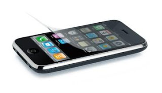
It's been a little more than a month since I took home my very own baby iPhone 3G, and in that time I've come to appreciate what I now know was one heckuva peripheral purchase: the screen protector. True, the phone itself is a hunka hunka burnin' usability, but the anti-glare protective film deserves some love, so here it is! First off, it gives me peace of mind; I know that any scratches can be banished for $14.95 (a new screen protector) rather than $400 (a new phone out-of-contract). Second, it's not kidding about anti-glare - the diffuse texture keeps shiny lights at bay without obscuring the display underneath. Third, it's very effectively anti-fingerprint - my greasy digits are powerless to leave smudges on this stuff. Finally, and this is perhaps my favorite, it's low-friction; like non-stick cookware, my fingertips glide across the display much more smoothly than possible on bare glass. It's so compelling that every time I use an iPhone without one, I can't help but think, "suuuucker!" And it's legitimate product design, too - finding that sweet spot, the combination of material, texture, thickness, and coating - it's not trivial! Hats off to you, screen protector; you're always welcome on my touchscreen gadgets.

PureText: Copy only what you want...

In my Windows and MS-Office existence, I tend to make more use of "Paste Special -> Unformatted text" than of the plain old CTRL-V shortcut. And hey, why not? It doesn't seem unreasonable that users would want to grab the content itself more frequently than the formatting that goes along with it - after all, what you're pasting it into already has its own format, thankyouverymuch. Recognizing this, freeware PureText gives you that function as a keyboard shortcut. It's the little things that can make using products delightful or miserable - and that goes double (or more!) for workarounds that you may have to employ dozens of times in a single day. Something like this might just keep some overstrained office worker somewhere from going postal - or a least delay it a bit...
[via Lifehacker]

iPods Have Outgrown Their Wheels...

Mark Wilson at Gizmodo writes a well-thought-out analysis of the ol' iPod clickwheel, and comes to a sad (but true) verdict: iPods have outgrown the wheel. He demonstrates with a stunning graphic, which I won't reproduce here, that the number of options, settings, selections, and functions has exploded since the devices were first introduced. He makes clear arguments both with succinct, accurate description ("The iPod went from doing one thing really well to doing a bunch of things pretty well. But the UI was never redesigned to accommodate the functionality.") and via appropriate metaphors ("Apple's sending city traffic down a one-lane, unpaved road."). He's also correct that the iPhone and iPod Touch don't suffer the same problem - ah, the glory of a full two-dimensional interface area over a one-dimensional rotational slider! Give it a read - and hope that this most recent batch of new iPods may be the swan song of the clickwheel...

Single-Use Caulk - Why not?

Nothing special here, just a single-use packaging design for caulk. But this begs the question, which products are appropriate for single-use packaging, and which should really be kept to more ecological full-size packaging? Caulk could go both ways, sometimes being needed for a quick fix and sometimes for a big-time installation. But is it a designer's responsibility to resist offering tempting single-use morsels in cases where they're not really needed? It would be great if such a "green imperative" had any influence on these kinds of design choices, but sadly, it just tends to be the need to sell more stuff!

Umbrella Today? The one-word weather report...

For those who don't live in the parched summer of Sacramento like myself, it can be a daily question whether or not an umbrella might be needed. And with a typical weather report, that's not always so easy to answer: "Chance of rain 40%, possible light drizzle fading to mist by mid-afternoon." Especially in the early morning, distilling that down to a yes-or-no answer is quite a task! So, along comes "the simplest weather report ever," Umbrella Today? Enter your zip code, and it answers the question. Done. As an added bonus, it can be set up to send a text message with the answer each morning. I admire the simplicity - now if only the message were delivered in an even more appropriate place...
[via Lifehacker]

Mini-Golf on the Roof!

Yes, this house in Igualada, Spain has a mini-golf course on its roof. A mini-golf course on its roof! Is it useful? I could point out the efficient use of space, especially as the same shapes provide equally interesting interior ceiling features and golf course obstacles; I could speculate that the turf covering is extra insulation, and probably deflects heat; I could worry that noise from golfers might distract inhabitants inside... But really, I just want to say: it's a mini-golf course, on the roof!
[via Gizmodo]

Laptop Sold In Messenger Bag: Green packaging isn't "packaging!"

I've covered a few environmentally-friendly instances of packaging being useful after it's done the job of packaging: for example, being used as a stand for the TV it contained, being used to make speakers for an iPod, or even being the product itself. But those are all cases (ha) where the packaging has been reused as something else; this is the reverse, where something else is used as packaging! HP won a Walmart-initiated contest to create a product that would reduce environmental impact, by suggesting that their laptop be sold in a real, useful messenger bag rather than cardboard and styrofoam packaging. The bag protects the laptop well enough, while taking less space (improving shipping and storage efficiency), and of course, being useful after purchase. Especially after my recent experiences with excessive packaging, this is a breath of fresh air! Let's hope to see more of this in the future - especially from mainstream juggernauts like Walmart, to show that environmental consciousness can work for more than just the die-hard treehuggers!

Proximity-Card Door Readers - Doing the pants-dance...

My workplace, and many others, uses proximity cards (AKA RFID) to access employee-only areas. Like Suity McBriefcase in the photo, you just get your card to within two or three inches of the reader, some radio-transmitting magic takes place, and the door unlocks. Neat stuff, but What I'd like to call attention to are the real-life use patterns I've observed having to do with those cards and the readers. Specifically, there are a lot of people (myself included) who just keep the card in a front pocket; and not infrequently, those worker-bees are buzzing around with both hands occupied, say, with a laptop and cuppa coffee. This situation leads to what might be called the pants-dance - trying to get the card to unlock the door from inside your pocket. The problem is that the readers are invariably installed just barely too high for this to be easy - though low enough that it's possible for most people. Hence, the pants-dance - lifting a leg, moving it around, hopping on one foot - it's entertaining, if not convenient. It also makes me wonder if there's anyone in the decision chain about where the readers are installed who thought to consider how they're actually used, and how a little change might just make a great big dancing difference!

(no) Clarity in Signage

This is a sign on the door of a local school cafeteria, and though a creative staffer had the opportunity to exercise different typefaces and capitalizations, the message got a bit lost in the shuffle. A first read - or any read from a certain distance - seems to suggest that FOOD must be kept OUTSIDE the CAFETERIA. (PLEASE.) The most important part of the message - the word NO - is lost in lilliputian font! Emphasizing the important parts of a message is fine, but you've gotta make sure those parts are cohesive on their own. And at the very least, this emphasis wasn't done with "quotes!"

NapTV - Keeping kids comfy and antisocial...

From designer Sung-kyu Nam, this concept for a child's multipurpose TV/stool/plaything isn't bad; little Jimmy will certainly grow up with a relaxed back (thanks to the fully-reclined viewing position), as well as an appreciation for late-2000's clean/angular, white/pastel industrial design. However, he might also miss out on a bit of socialization with his playmates - when he's under the NapTV, he's literally walled off from the rest of the world. I'd like to see a version with open sides, and maybe synchronized TV programs across several units in the same playspace, to let the kids share an experience with each other. There's plenty of time to use electronics to cut off social interaction when you're older...
[via Bornrich, Uberreview, and Gizmodo]

Label Your Thumbdrive

Lifehacker recently featured a reader-submitted idea that makes great sense, but unfortunately is just a little tougher to execute than it should be: label your thumbdrive with your name and phone number, so "lost" becomes "found" ASAP. This is the kind of behavior that designs should want to encourage people to adopt - but instead, it requires finding and renaming icon files, creating nasty-looking script files, hiding those files... not things that any novice would feel comfortable doing. So whose responsibility would it be do make these things easy? The operating system designer, which might recognize a new thumbdrive on first insertion? The thumbdrive maker, who might run proprietary software from the product? Or a third-party software company, offering a product they hope (against all odds) will be adopted for this purpose? And that's probably the problem - it's nobody's job, except that very astute reader on Lifehacker!

Freedom! (From your internet addiction...)

Sometimes the toughest hurdle to overcome on the way to productivity isn't a tool that's difficult to use, it's the tool that's too tempting to use - and derails users from productivity and into procrastination. The Internet, for all its productivity gains, can be distracting as all get-out: email, IM, Facebook, games, news, blogs (not this one, of course) - they're all trying to pry your attention away from the invariably-less-interesting tasks at hand. Well, Mac users have a bit of software they can enlist to conquer their demons - Freedom is an application which disables all of the computer's networking hardware for an amount of time that you specifty, allowing you to focus when you need to. The genius of this little program? Quitting it will not re-enable the hardware - you have to restart the whole computer! It's that little extra bit - not letting you cheat - that makes me confident that it'll actually get the job done... and make you get yours done as well.
[via Download Squad and Lifehacker]

Upcycling: Packaging is the Product (is the packaging)...

It's been a while since I've come across a good example of upcycling, so here's a refresher: "upcycling" is where materials are recycled into a product, use, or purpose which is of higher quality or value than the original. This is as opposed to "downcycling," which most recycling is, where the reused material becomes lower and lower quality with each cycle. Anyway, here's a radical upcycle: designer David Gardener presents this lamp which is made of the same paper pulp material as many egg cartons - a very low-quality substance which represents the last stop before landfill in the paper cycle. Not only that, but the lamp halves fold to become their own packaging. Say what you may about the looks of the lamp (hmm), but the concept is really something!
[via Treehugger, Dezeen, & Gizmodo]

You've Got Upgrades - Email innovations to hope for...

Gina Trapani over at Lifehacker has a neat little list of email innovations she'd like to see - and I've got to agree! Email has been around for quite a while but has been pretty stagnant for most of its life, so I think it's time for an overhaul. Read her whole list, but here are three I'm a fan of:

-Undo Sent Message- The ultimate fantasy feature, because it requires the system to work in a way that it's just not designed to! There are ways to approximate this function, but they all involve simply delaying the actual "send" of the mail.

-Snooze- Heh heh, I know the feeling! Pretend like you haven't even received the message, "for just a few more hours..."

-Attachment Reminder- A nickel for every time I've forgotten to attach a file, or received an email without a mentioned attachment, would make me a rich man! This existed as an add-on script for Gmail, which would give you a reminder message if you hit "send" without an attachment and you mentioned "attachment," "attached," etc, in the message. A must-have!

Auto-Flush Toilets: Useful or wasteful?

I'm in the Phoenix airport as I'm writing this post, inspired by a product I've encountered in airports the world over: automatic-flush toilets. When they first came out, they packed some "wow" factor - but now that they're thoroughly passe, what to make of them? Are they really performing a useful service to users? Let's check it out: the only two useful functions this product serves is to make sure that a flush occurs after each use, and not require the user to touch anything. These services, however nice, certainly aren't necessary - the next user can remedy a non-flush quite easily, and hands should be washed after each use regardless of whether you've had to touch a handle. And what are the costs of the convenience? Well, the hardware almost certainly costs more than a manual flush setup; electricity is consumed running the flush actuator and sensor (which presumably drains power 24/7); and my personal pet peeve, false triggers. By the time I've left the stall, I'm not surprised to have had the darn thing actuate 4 or 5 times, wasting gallons of water! No, I don't think it's worth it. We can do better for ourselves, our money, and our resources. Now if only those auto-flushers could flush themselves down the can...

Bluetooth Phone in Snowboarding Gloves

Dude - it's not easy keepin tabs on your bros when you're shreddin' a mountain. Ahem - seriously, phones have to be kept safe from ice and snow, and gloved hands can't use tiny mobile handsets or headsets. So, Swany is offering something of a solution: a Bluetooth headset built into a pair of snow gloves. It vibrates when the phone rings - a handy (get it?) feature - and a button on top of the hand answers phone calls. However, the product description has this detail: "speaker and listening device integrated into palm and thumb." I hope they have that backwards - just try simultaneously holding your palm to your ear and your thumb to your mouth! The other way around is definitely preferable - and would be quite literally talking to the hand.
[via bookofjoe and Engadget]

Push Email and "Message Mode Filtering"

My colleague in product usability blogging, Jasper van Kuijk, makes an excellent observation on his blog regarding how push email has disrupted "message mode filtering." The gist of it is that the medium you choose for a message indicates its urgency: email is the least urgent, text messaging more urgent, and a phone call the most urgent. Of course this system isn't spelled out anywhere - it's just something we've (mostly) come to naturally, societally adopt in a connected and wireless world. But push email, like that available on Blackberries, allows (or forces) users to treat email with the urgency previously reserved only for phone calls. It's a breakdown of the system that was so carefully (not) constructred by everyone! His whole explanation is worth a read - check it out on his blog, Uselog.com.

SleepTracker - Waking up right...

I've covered a few alarm clocks on this blog before, but for sheer improvement in quality of life, this one's potential seems tough to beat. The SleepTracker claims to monitor the various cycles of your sleep and "find your best waking moments" close to your desired wakeup time. I'm no sleep expert (ask my psych-grad wife for that stuff), but if that means the difference between a refreshing alert wakeup and a groggy stumble from quasi-dreamland, sign me up! Of course, it could all be snakeoil - depending on the theories on which it's based and the ability of its technology to deliver - but it's an intriguing and innovative thought to even attempt this kind of thing. Nice!
[via MAKE]

Software Design Usability Commandments!

On his wonderfully-named blog "Not The User's Fault," software developer Jono at Mozilla Labs lays down a 10-commandments-style manifesto for usable software design. Definitely read the whole thing, but I love these highlights:

"We software developers, being not exactly average users, must work extra hard to understand how average users will relate to our software."

"People say things to me like, 'Linux is only free if the value of my time is zero.'"

"When a user makes a mistake, don’t blame the user. Ask how the software misled them. Then fix it."

"The qualities of software that make for a good advertisement or computer-store demo are not the same qualities that make software usable and pleasant to work with long-term, day-in day-out. Often these qualities are opposites."

And, demonstrating a Steve-Jobs-like disdain for buttons in a hypothetical microwave: "The best microwave has no buttons at all. It doesn’t need any buttons because it already knows how long you want your food cooked and how hot. You never need to set the clock, either: it’s just always right."

Like Chopsticks with Training Wheels...

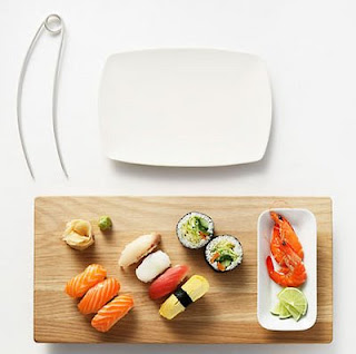
I grew up in the midwest, which didn't give me a lot of opportunity to learn or practice chopstick technique; this resulted in a rather steep learning curve once I moved to California and discovered that I love sushi. So maybe it's with folks like me in mind that Lincoln Kayiwa came up with the Tukaani - a bent-metal springy eating utensil reminiscent of a giant safety pin, but functionally more like chopsticks with training wheels. Is it really easier to use? Tough to say without trying, but it sure looks like it. And it's elegant enough - thanks to those gentle swooping curves, that it wouldn't be a complete embarassment to use, even in the company of chopstick masters.
[via David Report]

Mouse Hitches a Ride on your Laptop...

Those of us who like to use a mouse with our laptops do so at the cost of portability; when you add a mouse (and, God forbid, its cable) to the setup, suddenly you can't sling your laptop one-handed by your hip, lookin' all cool an' stuff. Instead, you're carrying the laptop flat and level, so the little rodent doesn't scurry off the edge, looking more like a nervous waiter with a tray of drinks. For better or worse, Logitech is trying a solution with its new v550 Nano Cordless Laser Mouse for Notebooks - the device comes with a tiny attach point to adhere to the back of your computer's screen, which lets the mouse hitch a ride when you go mobile. I'm not sure how I feel about adulterating the clean look of the back of my screen, and the riding mouse looks a bit like one of those fish that hangs out with sharks and cleans them and eats their scraps, but it might be worth it for the highly-mobile trackpad-hater. Hey, it's worth a shot!
[via Engadget]

Color-Coded Cutting Boards - A good idea with practical problems...

Color-coded cutting boards are out there in various incarnations, and they're certainly not a bad idea: use one color/logo (or in those pictured at left, both) per type of food that you don't want to mingle. Keeping your raw fish separate from your fresh veggies is a worthy goal! However, I've always found that in actual use, these boards just don't serve their purpose. And here's why: I don't know anyone who has enough cutting boards to be able to play by the color-coding rules all the time. It invariably ends up that, oh well, turns out you need to use the "fish-coded" board for chicken, and so it just happens in the craziness of the kitchen. And once that rule is broken, even once, it's tough to ever trust it again; it's back to good ol' memory (and looking at what appears to have been on a board) to determine whether it's good to use. Oh well...

Dog Doors - Finally, a perfect use for RFID!

Radio-Frequency Identification (RFID) has been "the wave of the future," at least to designers, for quite some time now. The problem is, that future seems annoyingly slow in coming - you know, along with stuff like flying cars and teleportation. Well, here's one application of RFID that's been deployed in a commercially available product, and put to excellent use. Plexidor dog doors use RFID tags on your dogs' collars to cue the door to open. Think of it like a garage door opener, but the pooch doesn't even have to push any buttons; the mere proximity of the RFID tag does the trick (ha). This keeps out strays, thieves, and the neighbor's darn dog, while allowing your dog to enjoy all the indecisiveness he or she needs regarding indoor/outdoor conundrum - which in turn allows you the happy pet owner to remain firmly planted on your rear. The future is here, and it is lazy!
[via Engadget]

iPhone (Finally!) - Same functions, just more fun...

Well, I finally did it - this weekend, I defied the lingering effects of the previous night's revelry, got up at 6:30am, and hit the Apple store for my very own iPhone 3G. (Along with my wife, brother-in-law, and sister-in-law!) I'm sure it will provide fodder for many future posts, but for now I'd like to take the overall gestalt, and I've found it to be this: most if not all of the iPhone's functionality can be found on other handsets. Internet, email, 3rd-party applications, location via GPS, music, video - all of these things can be done by quite a few phones out there. The difference is that the iPhone makes them easy - or heck, even fun! The most mundane actions, like setting an alarm clock, are simply delightful for their innovative and intuitive interfaces. Animations give the phone life, and it practically begs to be interacted with. And this is, in fact, a case of usability design: making functions so fun that they actually get used is indeed a service to the user. And so far, I'm certainly feeling well-served!

Not Useful, Just Fun: The Bubble Calendar!

This blog is supposedly about usable designs, and this one is anything but - but it's so much fun, I'll try not to feel bad about posting it. The Bubble Calendar is a big ol' sheet of bubblewrap on top of a calendar, giving you one, single, solitary pop per day. It's useless, really - you can't write anything useful on any of the days, and it's not all that easy to see at a glance whether or not a day has been popped. The only thing I can think of? By enforcing a daily limit of just that one pop, it may teach restraint - and an appreciation for delaying gratification.
[via Coolhunting and Gizmodo]